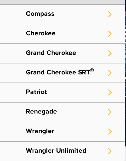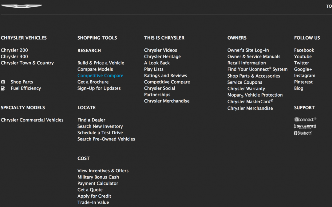


Different screen, different content
Content would gradually disappear from both the header and the footer as the screen size shrunk. The purpose of my content matrix was to make sure this loss of content was both consistent across brands, and made sense in terms of information hierarchy.
Footer Content Documentation
Keeping track of the various footer links across 5 brands and 4 breakpoints for each was also a complex necessity for the project.
