by micha343_wp | Jul 7, 2015
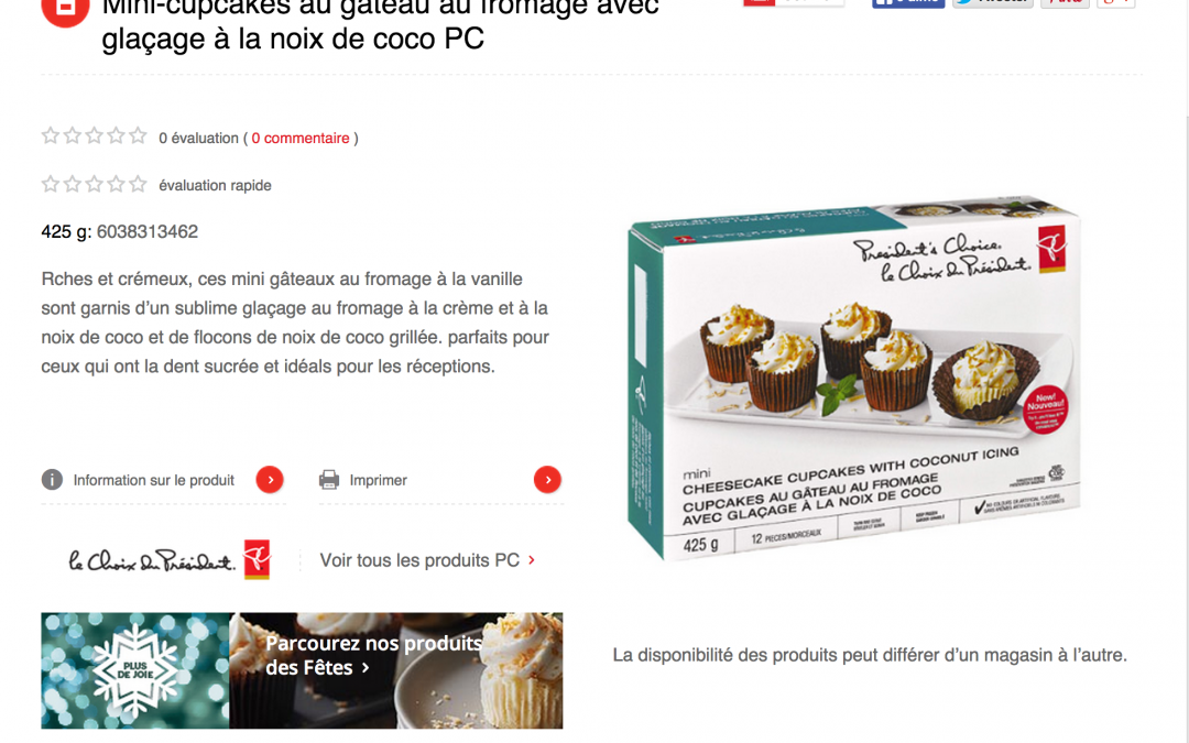
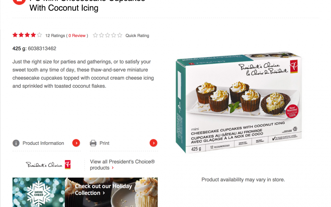
Because Loblaws is a Canadian brand, to serve their Quebec and other markets, all content must be displayed in both English and French. This created another version of each page that needed to be documented, translated, and localized.

by micha343_wp | Jul 7, 2015
Each holiday product had its own respective product detail page, rich with content. Each page is meant to display the ‘necessary’ information behind each product, and push users further into the site if they’d like a bit more detail. The PDPs also...

by micha343_wp | Jul 7, 2015
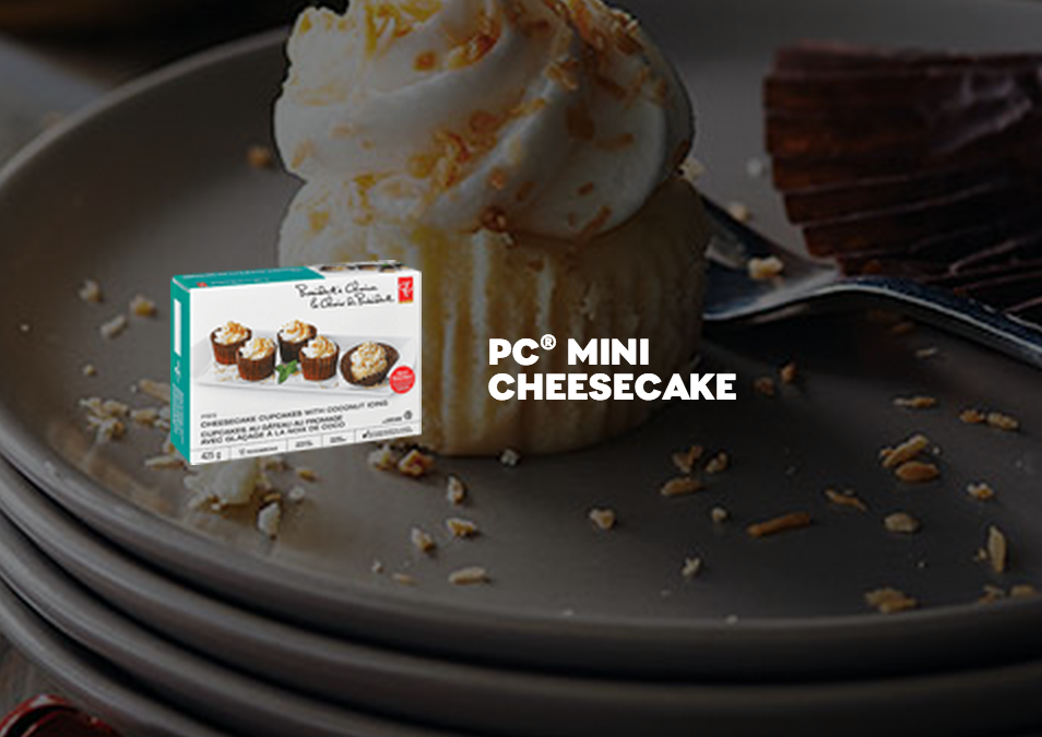
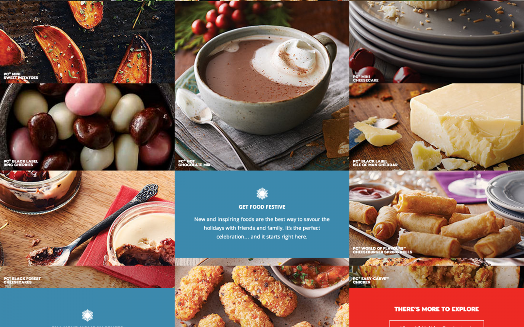
The holiday landing page itself was packed with complex functionality. Hovering over an image brought up a greyed out image state with the actual product packaging. Clicking further would bring up feature text for the product, with a button to proceed to the...

by micha343_wp | Jul 7, 2015
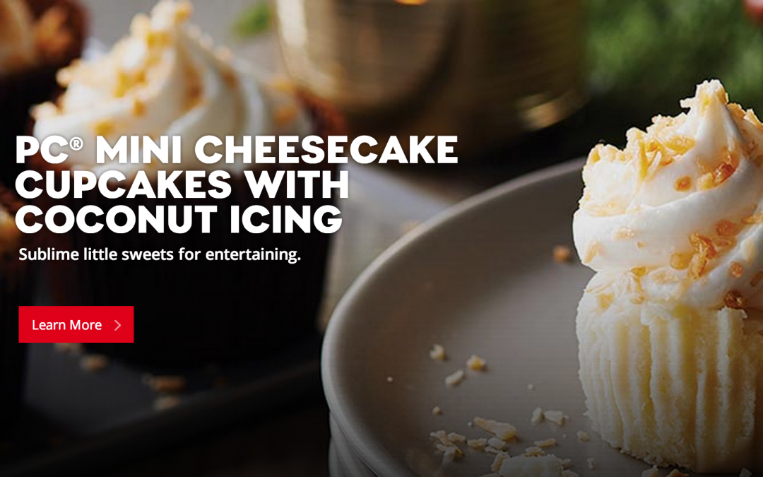
On-page modules for the page had to strike a balance of enticing the user to click, and featuring the holiday product. We did this with high-res images for each product combined with a few explanatory lines of copy.

by micha343_wp | Jul 7, 2015
The entire holiday landing page in aggregate. Each image is a module that links to a detailed PDP page. Other on-page modules link to other areas of the President’s Choice site.
