by micha343_wp | Jul 9, 2015
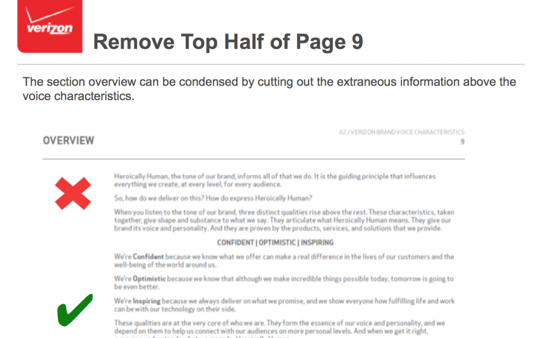
Rather than present our thinking with a long-list of things Verizon needed to do, we tried to make our recs into examples: showing what was good and what needed work about each of the major sections of the document. This way, Verizon’s brand team could create...

by micha343_wp | Jul 9, 2015
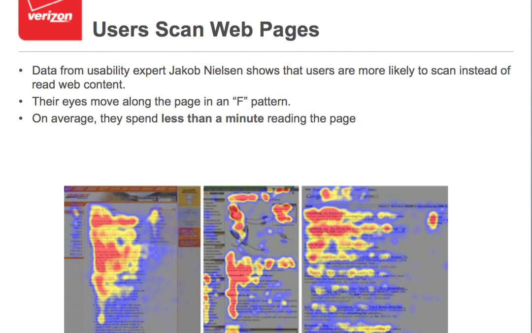
Because we were dealing with work that had been done and suggested by another agency, we made sure to ground each of our streamline recommendations in usability and other content insights. The F-scan theory by Nielsen Norman, shown here, was pivotal to us advocating...

by micha343_wp | Jul 9, 2015
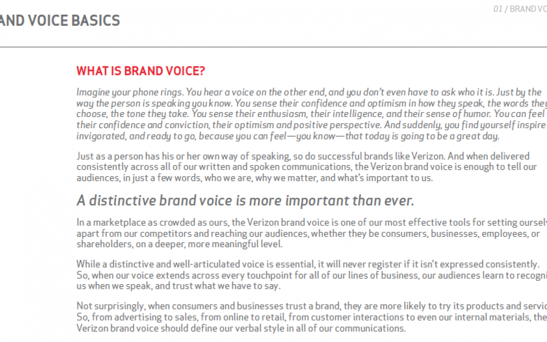
The existing digital brand documentation was a monster—a very large, text-heavy deck that convoluted more than it explained. Content Strategy’s work on this project was to focus on finding the important pieces of the document (ie, what brand center...

by micha343_wp | Jul 9, 2015
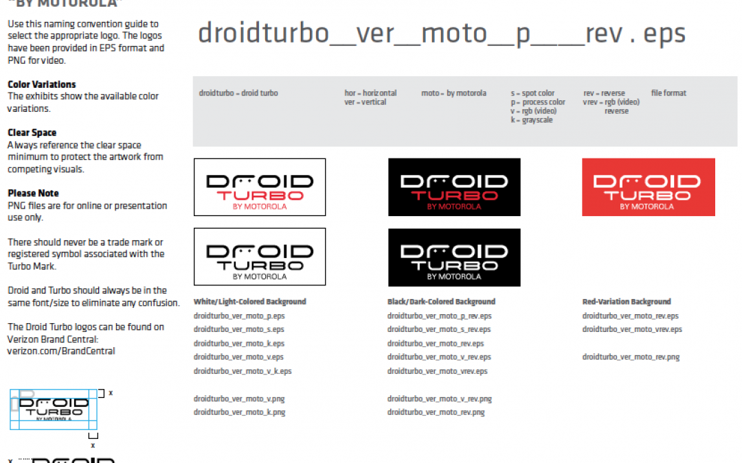
Verizon’s digital brand team had previously enlisted our help to develop a dedicated “brand center,” which contained content-rich pages like the one shown above. While content strategy didn’t focus on these pages themselves, we worked on...
